Alan Halter’s map cataloging tree canopy cover in Austin, Texas, blends narrative, images, and animation to show progress toward the city’s ambitious goal of 50% tree canopy cover by 2050. We caught up with Halter, a geospatial analyst senior at the City of Austin, to learn more about his approach and how the city extracts tree data from imagery.
Maps.com: What spurred you to create this map, and who do you hope will use it?
The City of Austin has provided tree canopy data through our Open Data Portal every four years since 2006. But the data creation process and a full analysis were missing. This ArcGIS StoryMaps [story] was created to explain the data creation process and analysis. It is intended for Austin residents and City staff, with the goal of clarifying our monitoring process and improving data access.
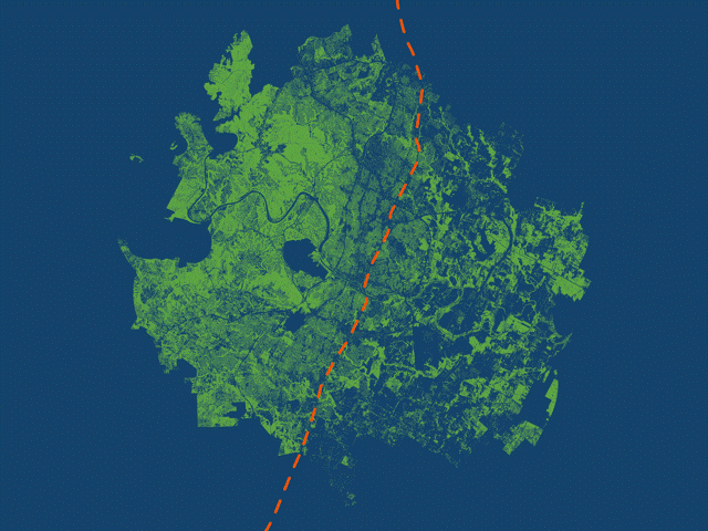
Halter used animations to highlight the geographic disparity in tree canopy on either side of I-35. (Source: City of Austin)
Maps.com: Can you talk a little about how you built this map? What tools and processes did you use?
The StoryMaps [story] displays various maps, including a tree canopy cover map which uses blue and green to emphasize where canopy exists and doesn’t exist around Austin. The stark divide in canopy density is brought out by these contrasting colors, and Interstate 35 symbolized by the orange line running north-south. Rather than create a busy map with a legend and labels, I used a GIF animation to clearly distinguish the east and west regions. Each frame in the animation is a separate map exported from ArcGIS Pro. The map scale stays constant while the different layers are turned on and off. I then inserted each map as a separate slide in PowerPoint, exported as a GIF, and embedded the file within the StoryMaps [story].
This process allows me to get multiple maps in one. Each map helps frame the story: this is what canopy looks like in west Austin, this is what it looks like in east Austin, and finally, citywide. The transition from frame to frame creates movement so the audience can see the additive effect of east and west Austin canopy combined into one citywide map. There’s no need for a legend explaining the color of tree canopy, or labels identifying where east and west Austin are located. All of this is left out and briefly explained in the text embedded below the map.
Maps.com: Did you encounter anything unexpected or surprising while you were creating this map?
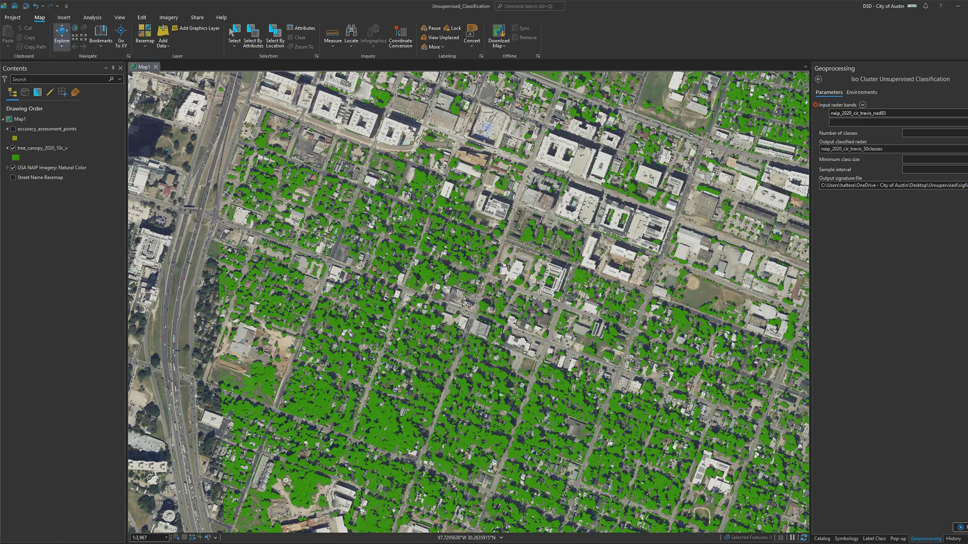
Processing tree canopy data is resource-intensive and can strain ArcGIS Pro due to the high image resolution (25–50cm) and the large study area (1,000 plus sq. mi.). Extracting tree canopy from this imagery creates complex polygon features, leading to memory issues and system crashes. Even minor map adjustments impact performance, making strong hardware and software updates essential.
To help extract tree data from imagery, Halter ran an unsupervised classification model as a starting point for exploring the image classification process. (Source: City of Austin)
Maps.com: If you could revisit this map, are there any changes or updates you would make?
If I were to revisit the map, I would consider highlighting areas where we’ve planted trees. This could involve mapping planting locations by census tract to single out heavily planted areas. Comparing canopy changes over time in these areas could demonstrate the impact of our planting efforts. Tim Wallace and John Nelson have done this with their “blend” maps.
Maps.com: What made you want to start creating maps in the first place?
I used to collect ski resort maps by James Niehues. His artistic skill in hand-painting maps from helicopter surveys—even showing individual trees and how mountain elevation and snow impact hillshade—was very inspiring, especially with the growth of digital cartography. These maps aren’t just fun to look at—they’re also functional. People use them for wayfinding and orienting themselves on the mountain. I like this blend of form and function.
Halter’s favorite map from Heinrich Berann shows Yellowstone National Park from a different perspective. (Source: Heinrich Berann/National Park Service)
Maps.com: What’s your favorite map?
Berann’s Yellowstone map. I like the colors, the interpretation of elevation, the oblique view, which is rare to see and difficult to pull off, and that it looks like one of those maps from an old geography textbook showing all the geographic features—like peninsulas, marshes, and volcanoes—in one location.
Maps.com: What kind of mapping projects would you like to explore next?
Our next round of tree canopy data will be produced for 2026. Typically, it’s derived from NAIP [(National Agriculture Imagery Program)] imagery, which requires flying airplanes in the leaf-on season, post-processing, feature extraction, and an accuracy assessment. This all takes time and planning. I’d like to improve this process by incorporating ArcGIS Pro’s Image Classification Wizard and pretrained deep learning models specifically designed to segment tree canopy. There’s a lot that happens before producing this map.
Featured Contributors
Alan Halter
Alan Halter is a geospatial analyst senior at the City of Austin, holding certifications as a GIS professional and ISA Certified Arborist. He leverages his expertise in mapping and data analysis to support Austin’s urban forest initiatives.

