• Explore Categories
    • Living Planet
    • People & Patterns
    • Natural Wonders
    • Odds & Ends
    • Behind the Map
Subscribe
Search Form
No Result
View More Search Results

Back to the Map: The United States of Natural Disasters

by Joshua Stevens
July 21, 2025
Behind the Map
The US faces many natural disasters, the type of which varies by location.

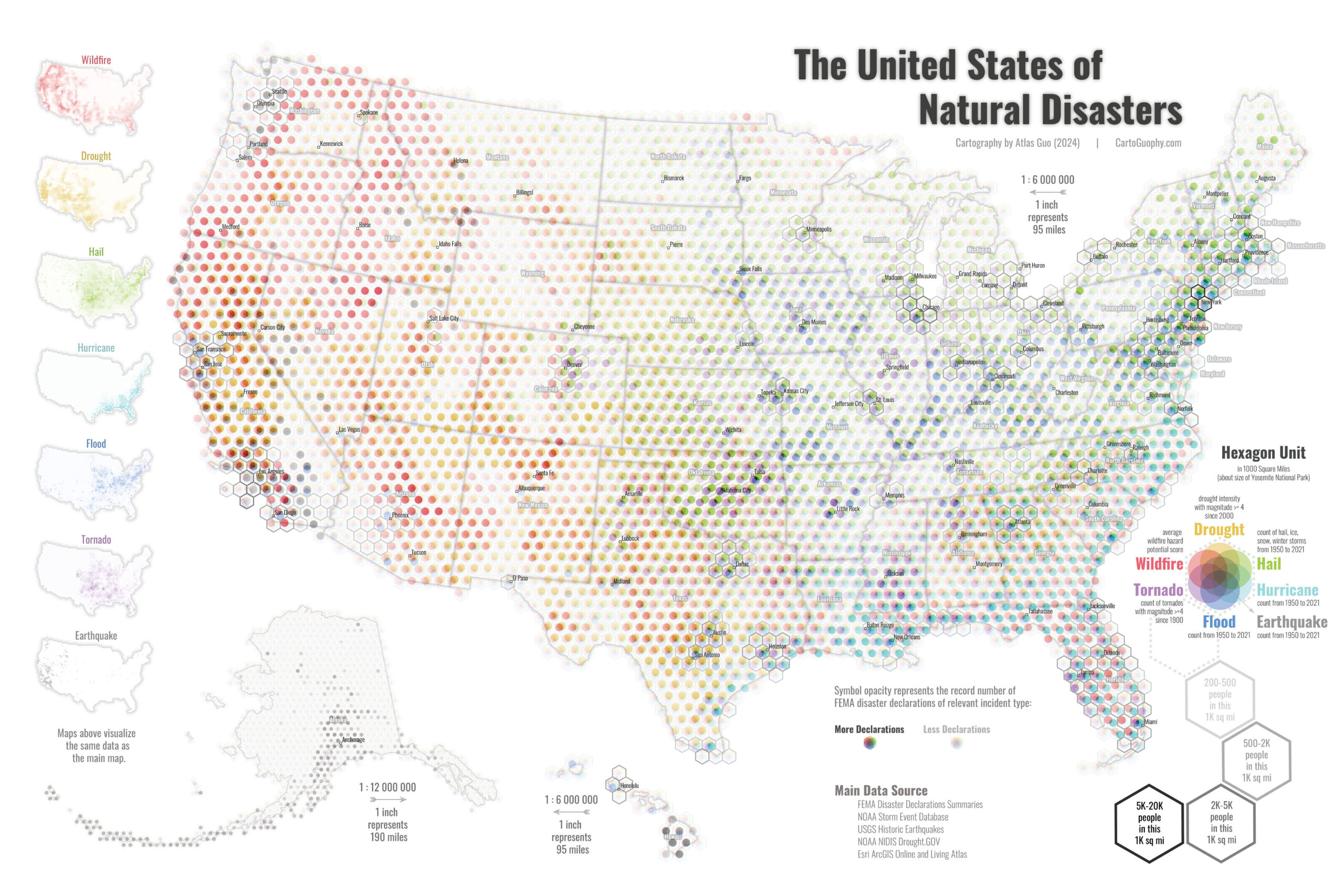
Chenxiao “Atlas” Guo developed a striking map showing the geographic range and frequency of natural disasters in the United States. The map beautifully communicates various risks that are more common in some areas than others. It also cleverly mimics the CMYK printing process, combining both art and insight to achieve cartographic success. In this installment of Behind the Map, we revisit this map with Atlas, a Ph.D. student in Cartography and GIS at the University of Wisconsin-Madison.

Maps.com: What was your inspiration for this map?  Who is it intended for, and what do you hope they take away from your map?

Guo: Effectively visualizing multiple variables has always been a challenging task in thematic mapping, and many visually creative solutions have been developed to address it. With this map, I aim to contribute my own exploration, primarily through the use of color. Specifically, I am experimenting with an innovative approach that preserves both the overall spatial pattern, and the ability to retrieve individual attributes.

The direct inspiration of this map likely comes from pointillism paintings. Instead of blending colors on a palette before applying them, pointillism artists mix colors in the viewer’s mind by placing carefully calculated dots of pure colors side by side. In fact, that is quite similar to how modern inkjet printers work—using far more precise calculations to apply extremely fine CMYK dots.

As for the topic of natural disasters, I’ve always believed that public awareness can never be too high—and that maps can play an important role in promoting it. I hope viewers can gain a better understanding of the distribution of natural disasters in the US through their interaction with this map, whether by disaster type or geographic region. Disasters are often associated with negative emotions, but I hope to present this knowledge in a relatively positive light, allowing readers to find some joy in the color blending and graphic design as well.

Maps.com: Can you talk about the software, tools, and techniques you used for this map? How did you gather the data behind it?

Guo: The tools I used to create this map are Esri ArcGIS Pro and Adobe Illustrator, which also represent the standard workflow of static mapmaking in UW-Madison’s cartographic curriculum. In fact, most of my previous static map products were created using this workflow.

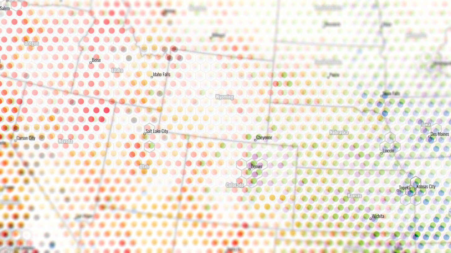
This map includes various types of natural disasters, with data sources listed at the bottom. I would particularly highlight the use of ArcGIS Online layers, which allow me to conveniently search for and add a wide range of online datasets directly within ArcGIS Pro. The next step involves proportionally aggregating data into pre-generated 1000-square-mile hexagon units, which are also created using ArcGIS Pro’s fishnet tool.

As for the multivariate symbols, they are created by blending multiple univariate layers of different colors in ArcGIS Pro, each with carefully set X and Y offsets. I spent considerable time refining the final symbol style, especially achieving a balanced degree of overlap: Without overlap, the overall pattern is unrecognizable. With too much overlap, individual attributes become indistinguishable.

 
The US faces many natural disasters, the type of which varies by location.
Different regions are prone to distinct types, and amounts, of natural disasters. (Source: Atlas Guo)

Maps.com: Have you thought of making a similar map for the whole world, or any other countries in particular?

Guo: I believe many cartographers and GIS analysts could easily replicate it. In fact, I’ve seen others apply my design to different fields, such as mapping energy types, which I greatly appreciate. I hope more mapmakers will experiment with this approach using their own dataset.
 
While further exploring possible indicators for natural disasters in the US, I came across FEMA’s National Risk Index (NRI), a more standardized and authoritative dataset. Rather than replacing the original seven variables, I used a similar visualization strategy to create a new map that represents 18 natural hazards simultaneously: The United States of Blooming Risks.
 
Maps.com: You’re pursuing a Ph.D. in cartography. Can you tell us about your research and the focus of your dissertation?
 
Guo: Though my recent achievements have focused on cartographic design, my doctorial research is more rooted in GIS than in cartography. Specifically, I am applying GeoAI techniques (i.e. machine learning models) to extract situational awareness information during hurricane disasters using location-based social media data. This involves conducting spatiotemporal analysis and visualization of specific scenarios, such as transportation mode detection and damage level assessment.
 
As my career goals increasingly shift toward cartography, I have begun incorporating more cartographic content into my dissertation. This includes content analysis of multivariate thematic maps, and automated extraction of thematic symbols, all within the broader context of natural disaster management. I hope that my dissertation, titled GeoAI-Powered Cartography for Natural Disaster Management, could serve as a bridge among GeoAI, cartography and the pursuit of social good.
 
Maps.com: What is it about maps and cartography that draws you to studying map design at the highest level? 
 
Guo: I have been a map collector and enthusiast since childhood, but it wasn’t until I joined UW-Madison that I realized I could become a real mapmaker—a cartographer. Although I am still far away from mastering the craft at the highest level, the extensive exposure to top-tier maps has brought me significantly closer.
 
Firstly, I want to emphasize the importance of learning from others’ outstanding excellent work, such as attending map galleries at cartographic conferences, exploring inspiring maps from online resources, and reading printed atlases of high quality.
 
Secondly, I believe it is essential to think more systematically and critically. While it is important to learn and respect the theories presented in cartography textbooks, we should not feel bound by them. These theories are based on past examples and aim to support the creation of maps that are generally “not bad.” However, many creative maps are made by selectively breaking the rules, especially when there is a strong and meaningful message to convey. It is crucial to fully understand the principles before deciding to bend them, and to do so with a clear reason.
 
Lastly, I highly value the inspiration from a wide range of fields. For example, from the direct observation of the natural environment, from scientific data visualization; from artistic creations across different media; from AI-generated imagery (it’s new and controversial, but we shouldn’t underestimate its value).
 
Maps.com: Some of your maps are labeled in multiple different languages. How do differences in language, culture, or global audiences influence your map design?
 
Guo: Yes, some of my maps include labels in English and/or Chinese (simplified and/or traditional). Aside from cases where clients specifically request bilingual content, I sometimes choose to include Chinese labels alongside English ones, particularly when I anticipate Chinese-speaking audiences.
 
Map makers are always the first readers of their own maps. In some of my personal mapping projects, I am also the primary reader (e.g. maps in memory of personal experiences) or even the sole reader (e.g. maps to assist with local bike route planning). In such cases, bilingual labels help keep me both geographically oriented and emotionally engaged, serving my role as both map maker and map reader.
 
Personally, I enjoy reading bilingual maps, but the most existing examples using English and Chinese fall short in terms of cartographic aesthetics. Adding a second language is not simply a matter of halving the available space. It involves comprehensive consideration of all aspects of typography, from placement to appearance. With formal training in cartography and strong familiarity with both languages, I hope that my bilingual mapping practices can contribute to more high-quality and thoughtfully design examples to the fields.
 
Maps.com: Thinking about all the maps and cartographers that have inspired you, what is your favorite map of all time?
 
Guo: To be honest, I had never thought about this question before, and could not immediately come up with an answer. After some careful reflection, I would give this credit to a 1908 panoramic map of Madison which I saw at the Wisconsin Historical Museum.
 
The reason is quite straightforward: I love history, I love watercolor, I love panoramic maps, and I love Madison. This panoramic map beautifully illustrates the key historical landmarks set within the distinct geographic features of Madison (e.g. the isthmus between the two major lakes), all rendered in a delicate watercolor painting style. I love it so much that it has become my desktop wallpaper, phone wallpaper, virtual background for meetings, and even the background of my homepage.
Toy bricks can be a great medium for abstract maps.
Guo displaying some of his abstract maps. (Source: Atlas Guo)

Maps.com: What project are you working on, or plan to work on, next?

Guo: I always have multiple mapping projects underway at the same time, most of which are purely for fun. While I may not be able to keep my website updated constantly, I frequently share these smaller, enjoyable projects on my social media platforms.

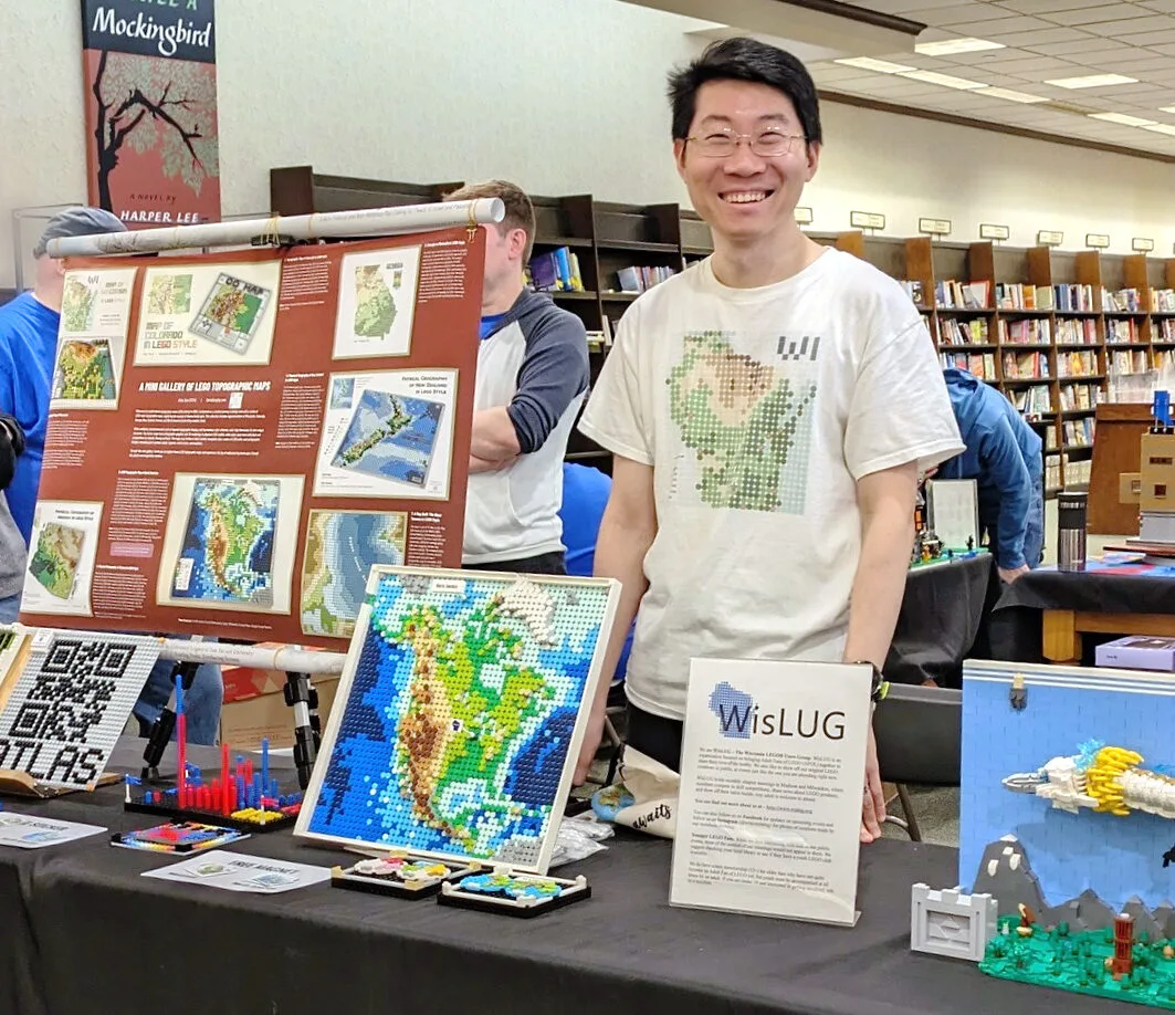
 Among all my projects, I am especially proud to introduce a series of LEGO topographic maps. This is probably the most joyful project I have worked on, and it holds great potential for children’s geography education. As a medium, LEGO offers several unique advantages: 1) Children are naturally familiar with it; 2) It can be easily purchased with consistent quality worldwide; 3) It provides remarkable mapping flexibility in terms of region, map type, color, and styles; 4) It allows for 3D terrain representation, something most paper maps cannot offer; 5) Its lack of geographic precision aligns well with the simplicity required for educational use and creates a distinctive aesthetic.

In short, I am currently developing two types of products. One focuses on posters of digitally rendered map graphics in LEGO software (Studio), with added labels. The other is based on physically built 3D LEGO maps, accompanied with guided instructions. Both types are easy to replicate and share widely.

As for the direction of my ongoing exploration, I am working on two fronts. On the one hand, I am designing various styles of topographic and thematic maps using LEGO; on the other hand, I am expanding the geographic scope to cover more states, countries and regions.

Featured Contributors

Atlas Guo

Atlas Guo

Atlas Guo is a Ph.D. student at the University of Wisconsin-Madison, studying geography (cartography and GIS), with a minor in computer science. At the University of Wisconsin-Madison, Guo is also a graduate student member of the Spatial Computing and Data Mining (SCDM) Lab and UW Cartography Lab (CartLab). His research focuses on spatiotemporal analytics, cartographic visualization, social media data mining, and natural disaster management. Prior to his doctoral work, Guo achieved an M.S. in Geography from the University of Georgia, and a B.S. in GIS from the Sun Yat-sen University.

Connect
Tags
Back to the Map Climate Change Disasters Drought Extreme Heat Flooding Submitted Map Weather
Share This Article

Keep Exploring

Photo of Austrian Alps.

Back to the Map: Avalanche Risk in Dachstein Area

June 10, 2025
Behind the Map
Back to the Map Snow
Screenshot of ArcGIS Pro showing a work-in-progress image for Map Turtles Mapped.

Back to the Map: Map Turtles Mapped

January 16, 2025
Behind the Map
Back to the Map Conservation
Small multiples maps showing ranges of different species of map turtles in the US

A Turtle-Shaped Map About Map Turtles

June 27, 2024
Odds & Ends
Conservation Submitted Map
View More Maps
Next Post
Salt Lake City mapped with one continuous line

Mapping a City with One Continuous Line

July 21, 2025 Odds & Ends

Maps.com
Explore Today.
Create Tomorrow.
  • About Maps.com
  • Submit a Map
  • Contact
  • Legal
  • Privacy
  • Media Use
  • Manage Cookies
  • Do Not Share My Personal Information
  • Legal
  • Privacy
  • Media Use
  • Manage Cookies
  • Do Not Share My Personal Information
  • Categories
    • Living Planet
    • People & Patterns
    • Natural Wonders
    • Odds & Ends
    • Behind the Map
  • About
  • Submit Map
  • Contact Us
Subscribe

  • Legal
  • Privacy
  • Media Use
  • Manage Cookies
  • Do Not Share My Personal Information

Add New Playlist

  • Categories
    • Living Planet
    • People & Patterns
    • Natural Wonders
    • Odds & Ends
    • Behind the Map
  • About
  • Submit Map
  • Contact Us
Subscribe

  • Legal
  • Privacy
  • Media Use
  • Manage Cookies
  • Do Not Share My Personal Information

Thank you!

We have received your request and will send updates about Maps.com to your email:

Continue reading article

Sign Up For Updates

Skip to content