There’s nothing boring about the aurora borealis. As charged particles from the Sun interact with Earth’s magnetic field, some of them travel along field lines and collide with other atoms in the magnetosphere. Excited by these collisions, the atoms release energy in the form of visible light. The molecular composition of the atmosphere and the altitude of these collisions can produce a vibrant array of greens, yellows, purples, and reds. It truly is a remarkable sight, and seeing an aurora is often considered a bucket list experience.
That’s exactly the case for Harry Kuril, a cartographer and outdoor enthusiast with a background in geophysics from Cambridge and MIT. But Kuril knows auroras are fleeting. Seeing these ephemeral whisps of light comes with no guarantee. In addition to the presence of charged particles waxing and waning with the solar wind, other environmental factors can enhance or impede one’s view of the night sky. To better his chances, Kuril turned to his experience as a cartographer.
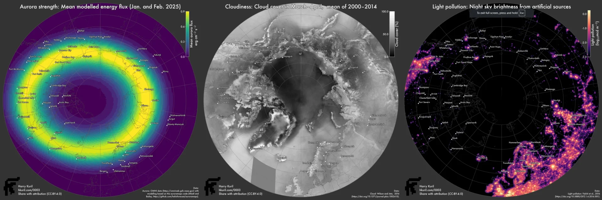
Available energy, cloud cover, and light pollution all influence the location and strength of visible aurora. (Source: Harry Kuril)
Using data from NASA, NOAA, and others, Kuril first mapped the average energy flux to estimate the strength of the aurora for a given time range. He then mapped average cloud cover to determine the conditions that might be typical for the season. Finally, a map of light pollution helps filter out locations too washed out with artificial lighting. By combining all these data, Kuril produced a metric to identify which areas offered the best chance to see the aurora. This aurora score, once mapped, provides a chart to the areas with a strong aurora, clear skies, and low influence from the cities below.
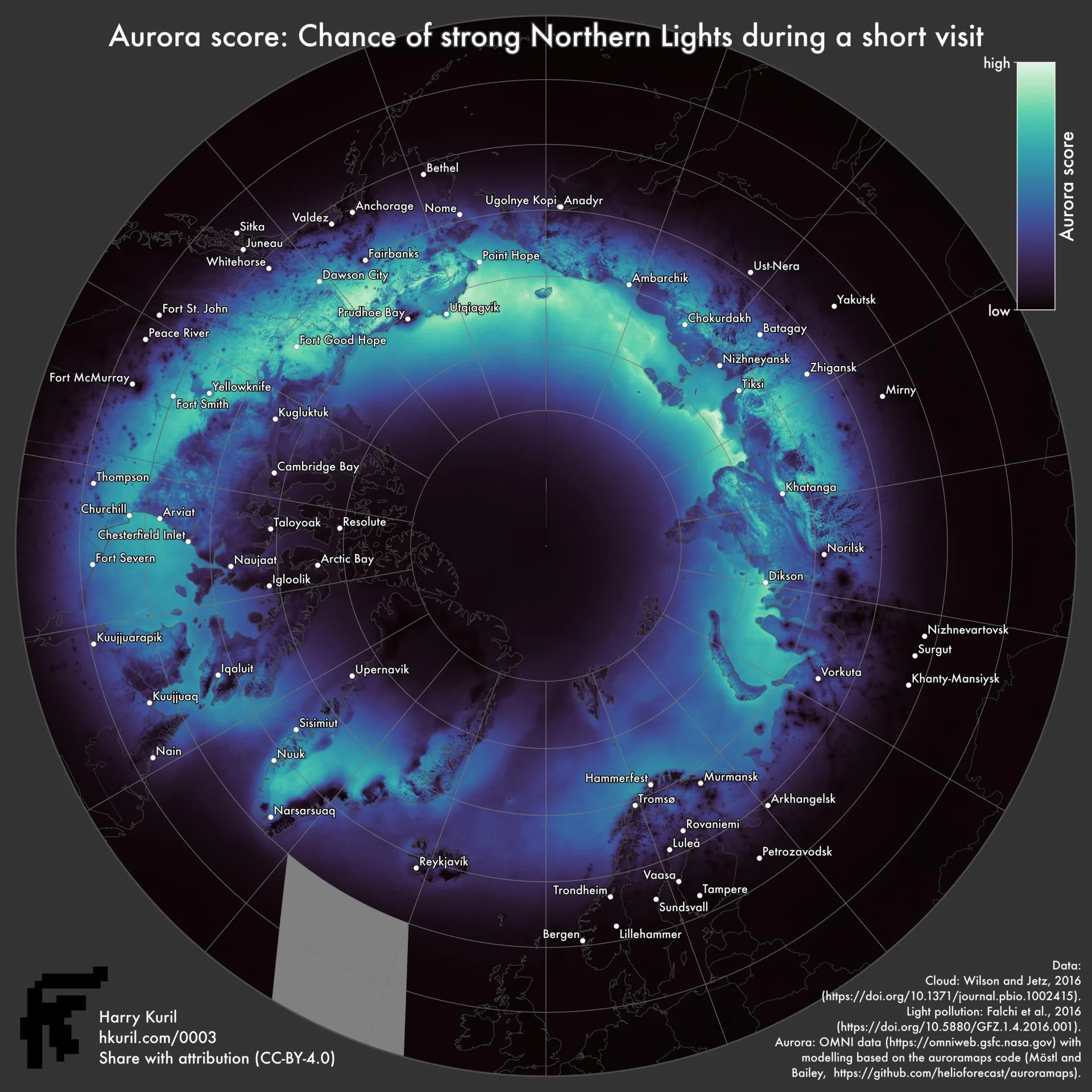
Kuril’s analysis culminated in a map highlighting the locations with the best potential to see the northern lights. (Source: Harry Kuril)
Mapped in a polar azimuthal projection, it’s clear that auroras are not symmetrical. Depending on the night, time, and solar activity, some areas will be bathed in a river of light while others see no indication of the aurora. Cloudy regions and those illuminated by infrastructure offer poor chances to see an aurora even during strong events. But a linear color palette that moves from black to blue to green-yellow highlights prime viewing locations.
Kuril used this map and set course on a three-night ferry around the tip of Norway. But just as the map suggested, cloud cover ultimately dashed any hopes of seeing the aurora. Nonetheless, these maps highlight the power of cartography to distill multiple types of data and information into decision-making tools. Kuril plans to revisit this project with refined parameters and continue his hunt for the aurora borealis. Whether or not he captures a glimpse of the phenomenon, his work illuminates the uniquely informative role maps can play in the process.