The United States generates and consumes a lot of energy each year. In 2023, the US Energy Information Administration (EIA) estimates the US produced nearly 103 quadrillion Btu (British thermal units) of energy. Consumption was slightly lower at nearly 94 quadrillion Btu. To support this demand, the US relies on a complex grid of generation sources (and types) and distribution lines.
This poster from Houseal Lavigne highlights multiple dimensions of the US electrical grid through a collection of maps and charts. It uses data from federal sources, industry groups, and others to explore infrastructure networks, generation capacity by state, and more.
Mapping the Grid
(Source: Houseal Lavigne)
The first map labels the three main grids in the US: the Eastern Interconnection, the Western Interconnection, and the Electric Reliability Council of Texas (ERCOT). Within each interconnection area, power is generated and distributed across the network as needed. This means the energy a given home or business uses may not come from the closest source. In the map, brown pipelines and white distribution lines connect to blue power plants across the country.
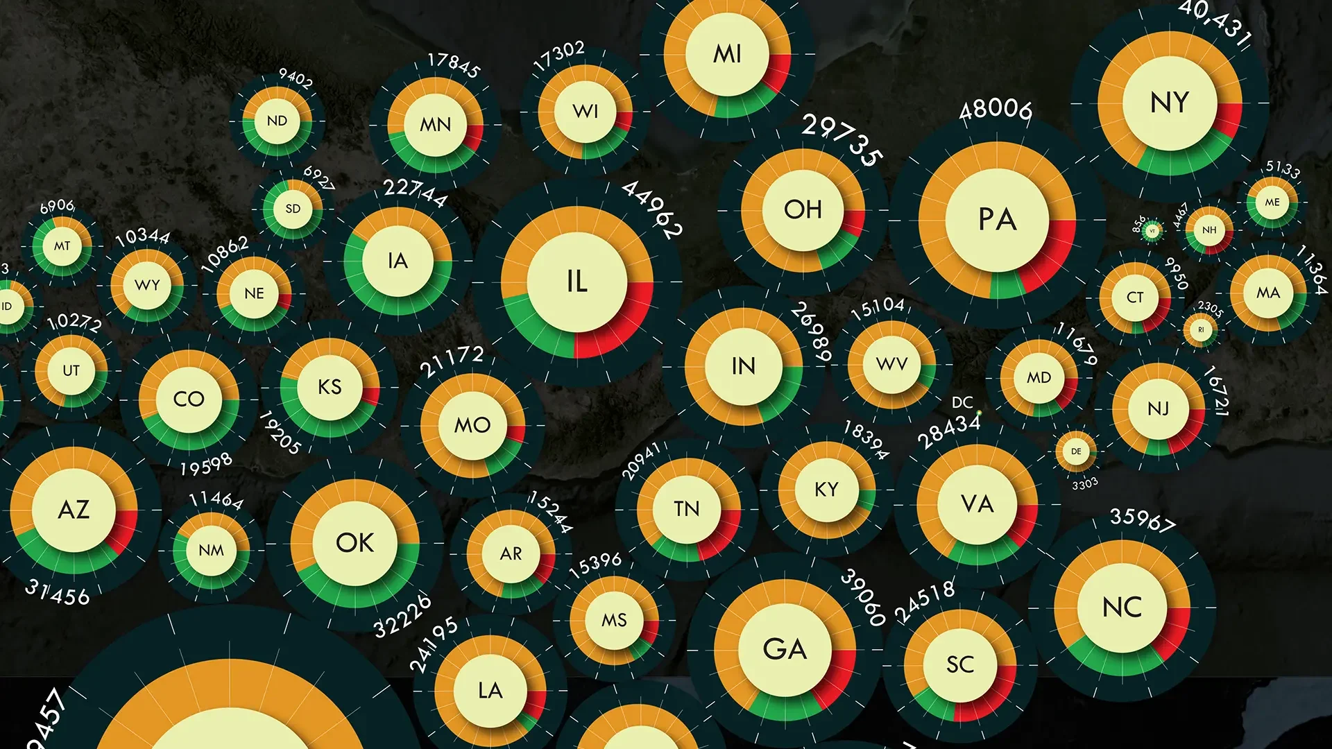
A State-Level Perspective
(Source: Houseal Lavinge)
The second map is a cartogram that documents energy generation capacity by state. The size of each circle reflects the state’s overall energy generation capacity. Within each circle, colored slices show the mix of sources used in each state.
States west of the Mississippi River tend to have more renewable energy sources such as wind or solar (green slices). In the eastern US, nuclear energy (red slices) is more common. And across the entire country, nonrenewable sources (gold slices) like fossil fuels dominate as a major source of energy. California, Texas, and Florida are the leading producers in each interconnection area.
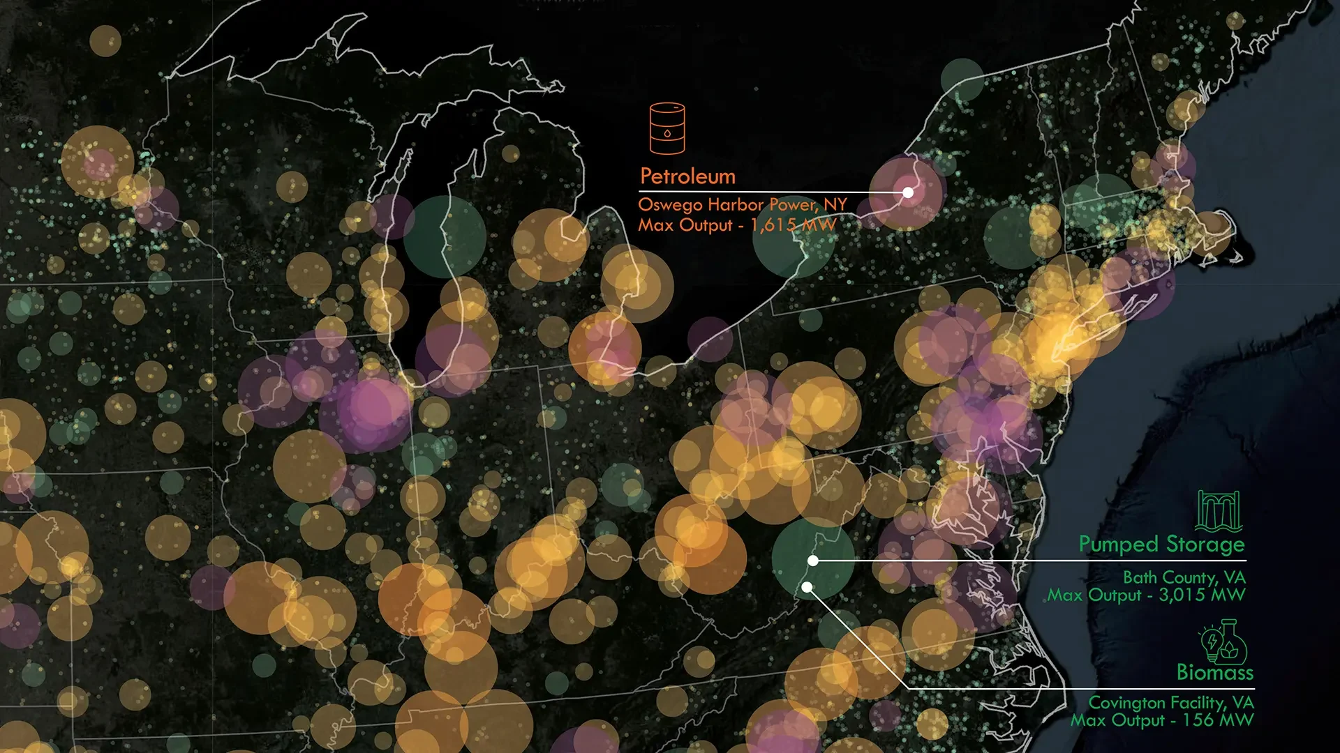
Individual Power Plants
(Source: Houseal Lavigne)
The third map shows the locations of more than 10,000 power plants in the US. Each power plant is drawn with a circle that shows its max output (size of the circle) and source (green for renewables, gold for nonrenewables, and purple for nuclear). Callouts identify the largest producers by source. Washington’s Grand Coulee Dam hydroelectric plant has the highest max output in the US at 7,079 MW (megawatts).
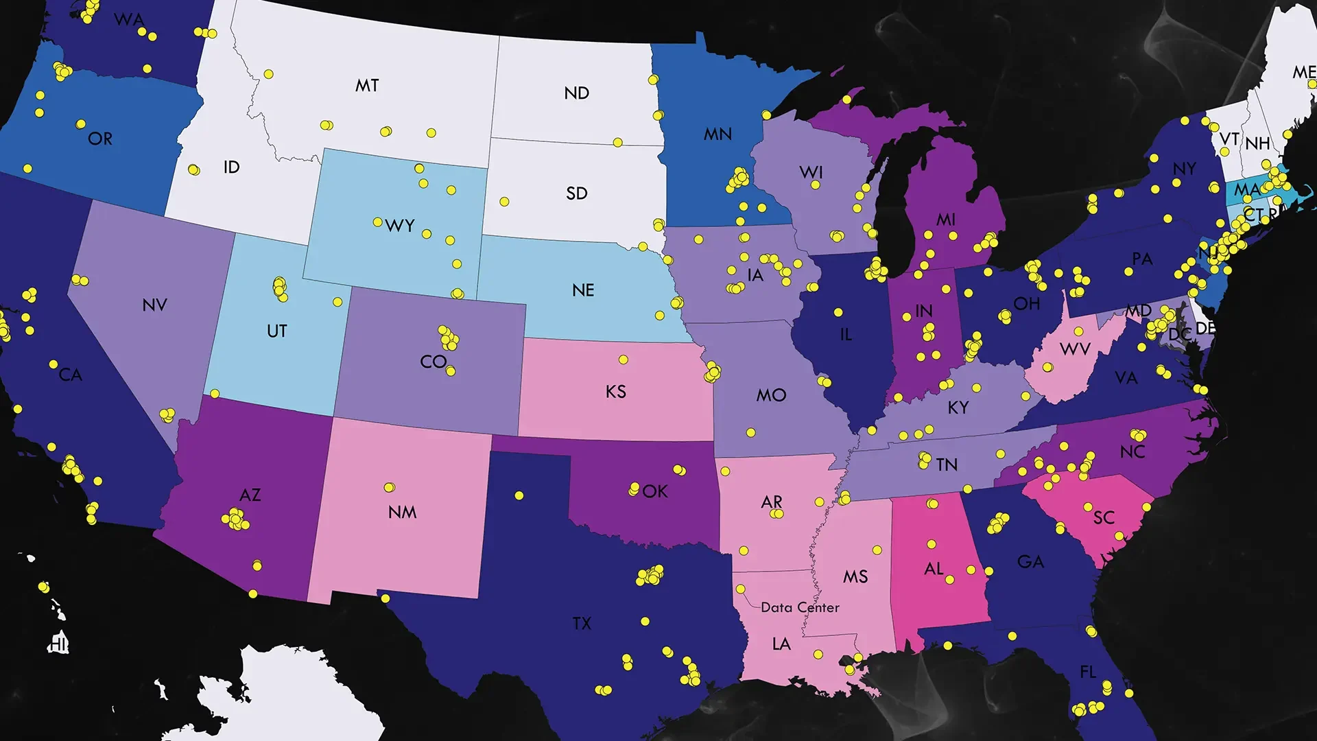
Accelerating Demand
(Source: Houseal Lavigne)
The final section of the poster focuses on future energy needs. Thanks to the rise of data centers and AI, as well as continued adoption of electric vehicles and industrial needs, demand for power is expected to rise sharply in the next decade.
A bivariate map shows the relationship between the number of data centers by state and the max output by state. Yellow dots show the locations of more than 1,300 data centers in the US. States with high numbers of data centers and greater max energy outputs include Washington, Illinois, Virginia, Pennsylvania, and others. Maine, Idaho, the Dakotas, and others have relatively few data centers and lower max outputs.
