Editor’s note: We’re launching a new article series on Maps.com to give you more insights into the mapmaking process. Behind the Map will feature cartographers explaining, in their own words, the how and why behind their approaches to maps and visualizations.
Last December, Peter Atwood became our first featured contributor with his mesmerizing map of the 2023 Canadian wildfire season. We recently caught up with Atwood, a cartographic designer at Esri, to go back to the map and get more details about this animation.
Maps.com: What was your inspiration for this map? What spurred you to create this?
Atwood: Like many Canadians, I spent the summer of 2023 following the record-breaking wildfires that swept across the country. By the end of the season, wildfires had burned more than 18 million hectares of forest across every province and territory in the country. My home province of Nova Scotia saw both its largest recorded wildfire and its most destructive.
As the season finally drew to a close, I decided to try to visualize the season as a whole. Instead of looking at each fire as a separate event, I wanted to see what patterns emerged when the country was viewed as a whole.
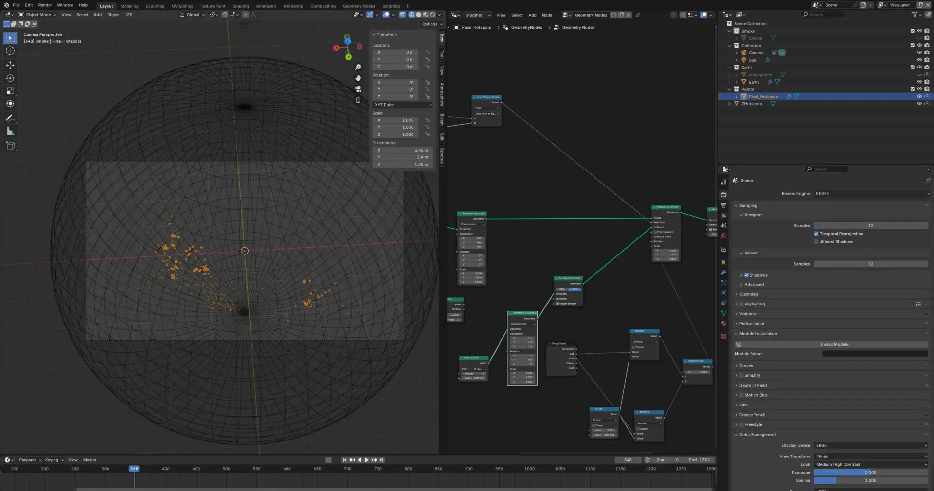
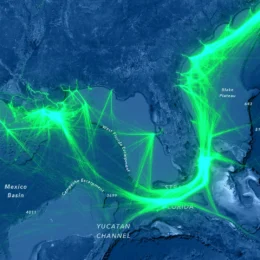
Atwood used satellite-detected hot spots to map fire locations for his animated map of Canadian wildfires. (Source: Peter Atwood)
Maps.com: Can you talk a little about how you built this map? What tools and processes did you use?
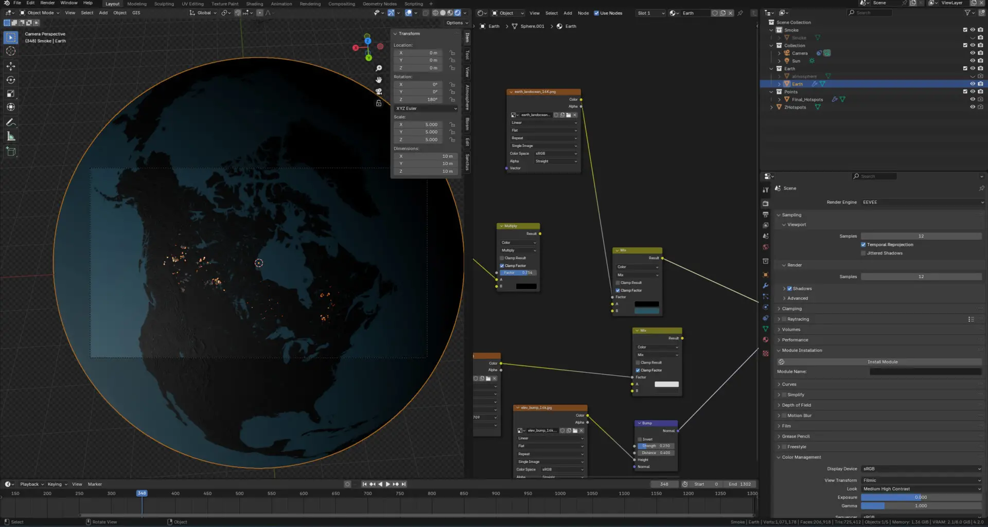
Atwood: For this animation, I wanted to visualize both the locations of the fires themselves, as well as the plumes of smoke which spread across North America. For the fires, I used satellite-detected hot spot data from NASA’s Fire Information for Resource Management System (FIRMS), while for smoke data I used atmospheric aerosol data from NASA’s Goddard Earth Observing System (GEOS) climate model.
The aerosol data came as a series of netCDF files which combined multiple types of particles into one dataset. I used Python to extract the measurement of black carbon in the atmosphere and convert it to a sequence of images. Finally, I brought all the data into Blender, an open-source 3D modeling and animation tool, to combine and animate it.
Maps.com: Did you encounter anything unexpected or surprising while you were creating this map?
Atwood: One challenge when working with the FIRMS hot spot data was filtering out false positives. Urban and industrial areas often contain sources of heat that are detected as possible fires by satellite. I researched and tested a few different filtering methods and compared them to areas with no false positives (mostly oil and gas refineries) to try to find an approach that would filter most of them out.
Maps.com: If you could revisit this map, are there any changes or updates you would make? Why?
Atwood: If I were to revisit this map I would probably include some additional information to provide geographic context, like provincial boundaries and the names of major cities. One of the principles I try to follow when making a map is to only include information that is useful to the reader whenever possible. I find that this helps to make maps that don’t feel cluttered and are easy to read. In this case, a bit more information would be helpful, to help readers understand what parts of the country were most impacted.
Atwood used Blender, an open-source 3D modeling and animation tool, to create his animated map. (Source: Peter Atwood)
Maps.com: What made you want to start creating maps in the first place?
Atwood: I was first introduced to GIS and cartography while I was studying archaeology. I found it was an amazing tool for making complex data and ideas easy to understand. Whenever I get interested in a new topic, I try to learn enough to be able to make a map with it. If I can make a map that’s easy for someone else to understand, it makes me feel confident that I understand it myself.
Maps.com: What’s your favorite map?
Atwood: One of my favorite maps is Eleanor Lutz’s map of the solar system. One of my favorite types of maps are ones that visualize a large number of points and let patterns emerge organically from the data. This map combines those points with striking colors and typography to create a portrait of our solar system that is both incredibly detailed and yet easy to understand.
Maps.com: What kind of mapping projects would you like to explore next?
Atwood: A lot of my recent work has been developing tools for procedurally visualizing and animating data using programs like Blender and Houdini. Having tools that can automate some of the steps involved in processing and mapping data makes it a lot easier to work with large datasets, and makes it possible to produce visualizations responding to current events more quickly.
Featured Contributors
Peter Atwood
Cartographic Designer
Peter Atwood is a cartographer originally from Nova Scotia, Canada specializing in data-driven animation and 3D visualization. He currently works as a cartographic designer as part of the Creative Lab at Esri.