Borders and boundaries help us organize the world. While they can be geographic (for example, rivers and mountains), most borders are not naturally occurring. And they often lead to conflict. From territorial disputes to gerrymandering, these artificial lines can have real consequences.
This interactive map from the Education Funding Equity Initiative at New America shows the impact of another type of border: school districts. It explores how these human-drawn lines can segregate communities and impact educational outcomes.
School districts are funded by local, state, and federal sources. Most local funding is driven by property taxes. In some communities, property values are still depressed by the effects of policies such as redlining or racial covenants. So, where a school district line is drawn can impact funding per pupil.
The map reveals findings from an analysis of 24,568 adjacent school districts in the US. It measures how districts that share a border compare across two key student demographics:
Poverty rates of school-aged children
Racial composition of enrolled students
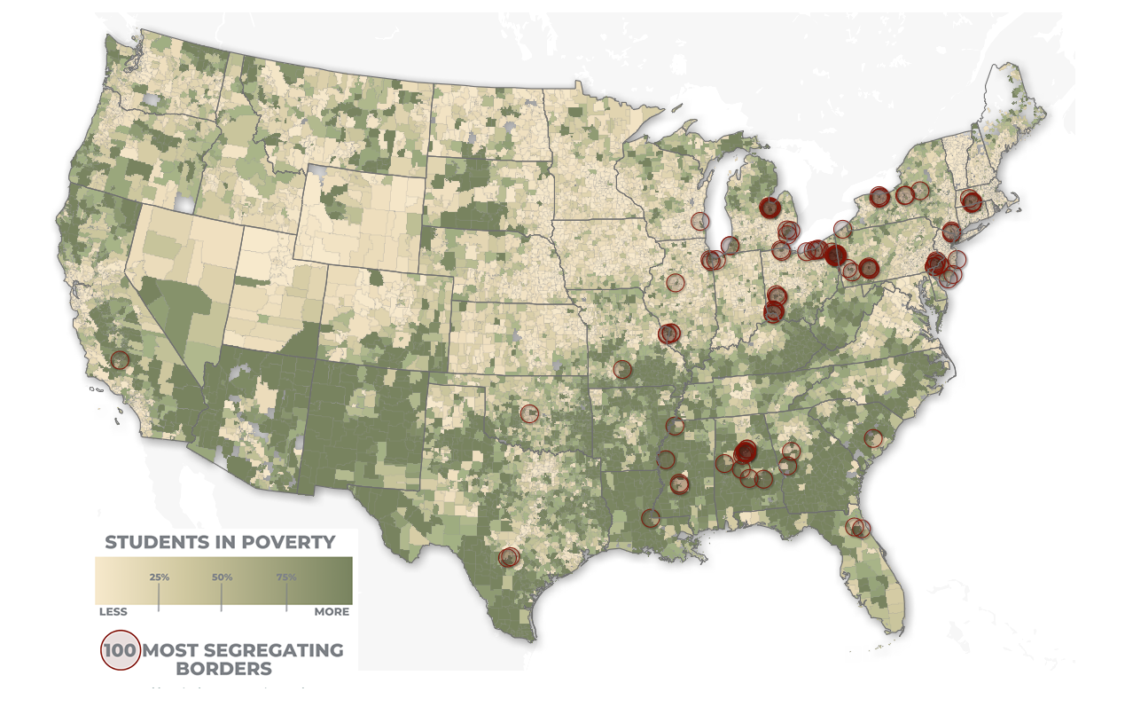
A majority of the most segregating school district borders for students in poverty are located in districts in the eastern part of the United States. (Source: New America)
The first view in the map focuses on poverty rates. Red circles highlight the 100 school district borders with the largest difference in poverty rates between them. Clicking a district shows its funding from local, state, and federal sources. You can also see the type of district, number of students, and demographic details.
The map then zooms into specific district boundaries to provide local case studies. The first example in New York shows how redlining still impacts the Utica City School District. Unlike the neighboring New Hartford Central School District, the Utica City School District receives far less local funding. The net impact is that students in the Utica City School District receive about $1,000 less per pupil than their peers in New Hartford. Although states sometimes try to make up for differences in local funding, gaps remain.
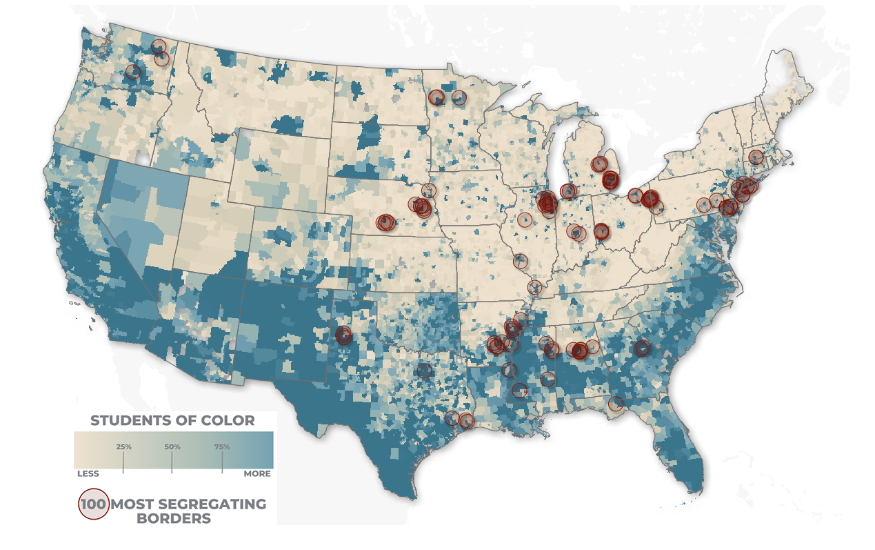
School districts in the southern part of the United States and along the coasts have higher shares of students of color. (Source: New America).
As the map continues, it also explores the most segregated borders in terms of students of color. It notes that, “On average, the districts serving more students of color collect $2,222.70 less in local revenue per pupil than the predominately white districts across these borders.” Additional case studies explore impacts in Texas and Washington, as well as ramifications for Native school districts in South Dakota.
The good news is that school district boundaries are not permanent. They can be changed and updated. As the map notes, a potential solution is more inclusive district lines, which can help address these differences and close the gaps. Maps like this can help policymakers prioritize the most segregating districts and serve as a road map to a more equitable future.
