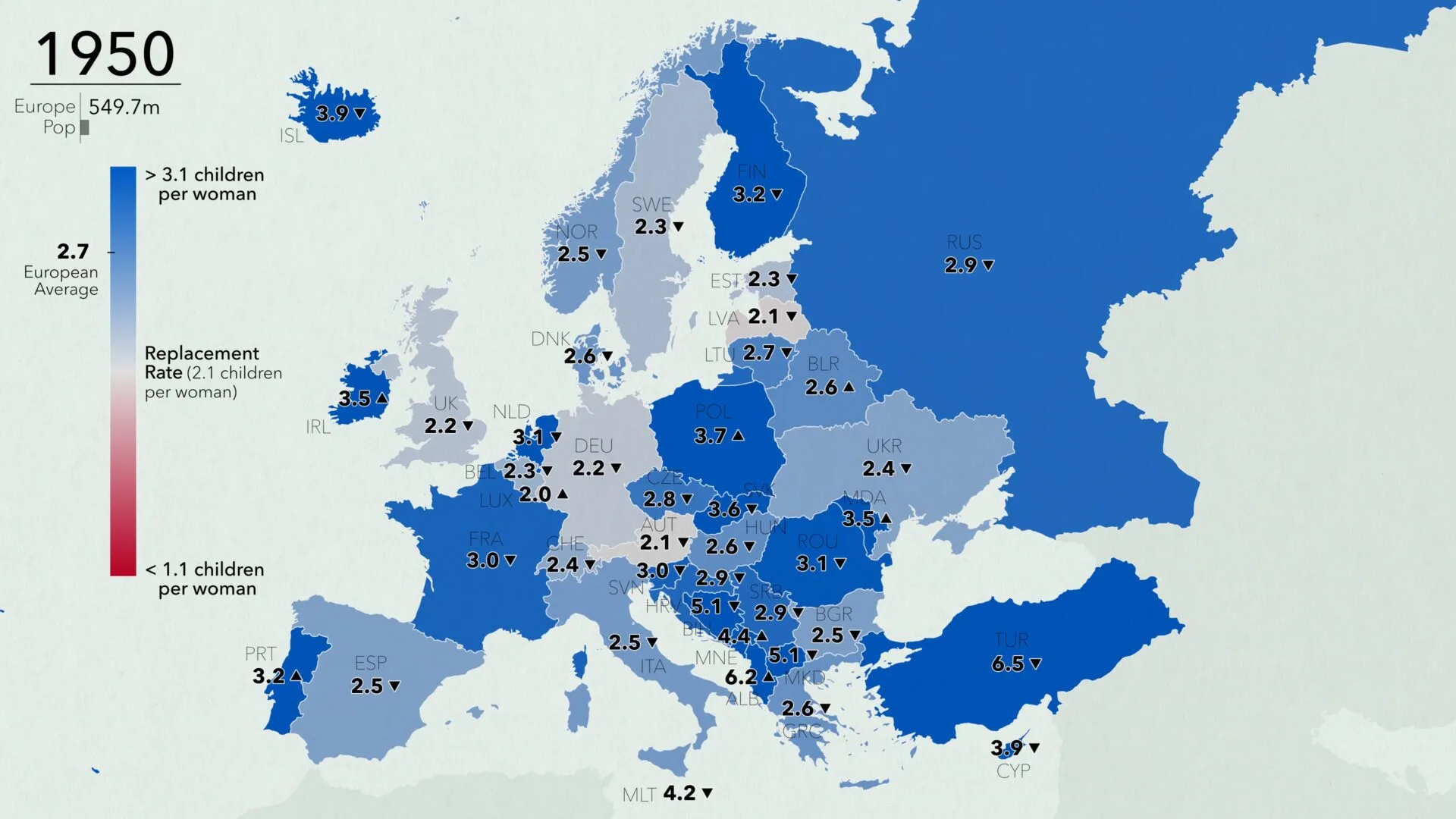
Earth’s population is in the midst of two notable trends that will impact humanity’s future. People are living longer than ever before. At the same time, population growth is slowing and beginning to plateau. The UN predicts that Earth’s population will reach its apex in the 21st century before declining. This is due to a global drop in fertility rates (the number of births per woman in her lifetime). And while fertility rates are declining globally, they are dropping faster in some places than others. Among the continents, Europe has the lowest fertility rate.
This animated map tracks fertility rates in Europe from 1950 to 2025. It uses modern borders and data from the United Nations Population Division to illustrate the change in fertility rates.
In 1950, nearly every country in Europe had a fertility rate equal to or higher than the replacement rate. (Source: Maps.com)
The map symbolizes countries based on their fertility rate in a given year. Countries above the replacement rate of 2.1 births are blue, while those below the rate are red. Countries near the replacement rate draw in more neutral grays. The intensity of reds and blues show deviation from the replacement rate. A ticker on the legend marks the average fertility rate for Europe over time, while a bar below the year tracks Europe’s total population. Arrows in each country show how rates are changing relative to the previous year.
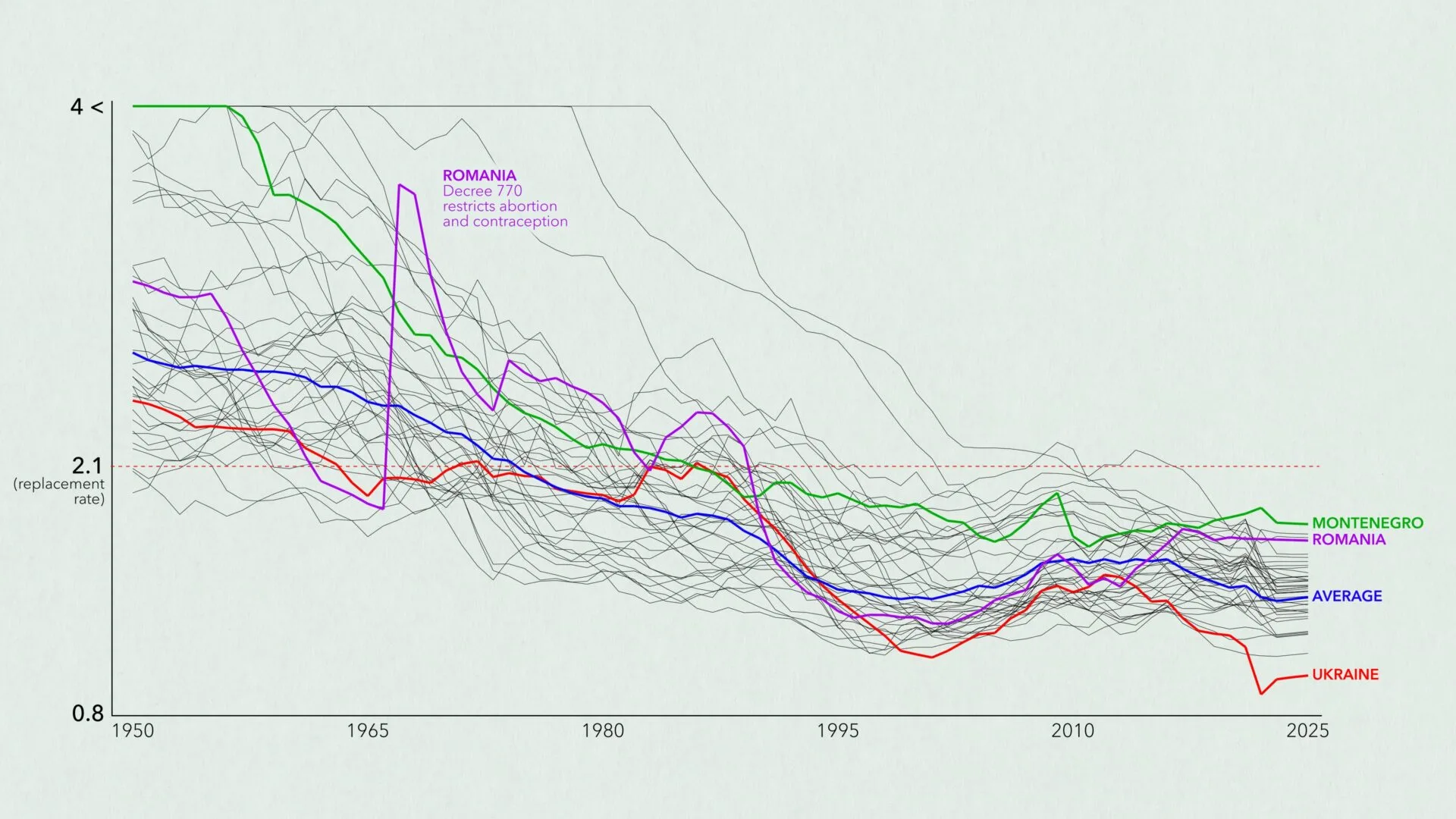
As time passes, countries change colors and shades to represent changing rates. Faster changes in color represent larger shifts in the fertility rate for a given country. Fertility rates initially trend downward, with that trend accelerating in the 1960s. By 1973, the European average falls to the replacement rate of 2.1. The rate continues to fall until bottoming out at 1.4 in 2002 before rebounding slightly. It never rises above 1.6 again.
A few interesting patterns emerge over the 75 years:
In the mid-1960s, the fertility rate increases sharply in Romania for a few years after previous years of decline. This reflects Decree 770, which banned abortion and contraception in an effort to improve the country’s fertility rate.
Europe’s population grows by nearly 200 million people over time despite falling fertility rates. This is the result of mass immigration to Europe following World War II. Immigration has continued, with high numbers of refugees immigrating as people flee conflicts in other parts of the world.
Europe’s total population peaks around 2022 and drops in the following years. This is likely a result of the COVID pandemic and the war in Ukraine.
The video ends with an animated chart graphing each country’s fertility rate from 1950 to 2025, along with the European average. The map and chart make it clear that fertility rates fluctuate over time but ultimately trend downward. While immigration has sustained Europe’s population in the past 75 years, recent policies may alter that trend moving forward.
While rates fluctuate by country, fertility rates have fallen sharply since 1950. (Source: Maps.com)